Select Car Leasing's existing platform and backoffice was no longer fit for purpose and so we undertook a complete rebuild of their website from the ground up, not only to modernise the technology, but to re-imagine, improve and optimise key user tasks. A business critical system for the procurement, marketing and sales teams to perform their daily jobs effectively.
Each team had their unique needs and wants with lots of dependencies between them so we set about uncovering a broad set of critical paths and building a 'deep-enough' understanding across all the departments within a short space of time.
We started broad and shallow, and over time, as we focused on specific features, we went progressively deeper to gain the appropriate level of insight and understanding of individual behaviours and team processes depending on the stage of iteration.
The pace of the project was fast which led to a lean approach to the visual design channelling most effort towards the most complex and critical screens.
I was one of two product designers and led the client through bi-weekly demos and regular workshops and conversations to understand and document requirements, translating context to the wider team as the project unfolded and things invariably changed.
As Lead Designer it was my job to observe, learn, translate and validate complex and often poorly defined technical requirements into meaningful user stories, flows and workable designs for the engineering team to implement.
Across the board, there was a lot to learn. Rebuilding and improving an entire platform is no small undertaking so we needed to break the complexity down into smaller parts while keeping up the pace and staying focused on the bigger picture of what this new system would aim to achieve for the business.
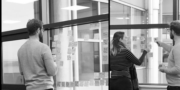
Over the course of 2 weeks we interviewed key stakeholders from around the business straddling the process of understanding the overarching strategic vision of the business with senior leaders, to the practical day-to-day processes of the staff and teams.
Through these interviews it became clear that the legacy system had given birth to some ugly workarounds and cumbersome processes that were causing extreme inefficiencies and holding the business back*.*
So, we needed to get to grips with how the current system was being used, for what purpose, and where the pain points were for obvious improvement. Enter the Procurement team (the lynchpin)…
Despite an attempt to separate the team (internal politics), we pulled them all together to facilitate a productive and collaborative discovery session. Using workshopping techniques from the Design Sprint process we quickly uncovered the pain points and critical processes.
What we came out with was an array of problems and potential solutions from the people who actually use the system on a daily basis, and some key insights to start conceptualising and building into the working prototype.
For each new deal you have to enter the dealer information 6 different times
💡 How might we prevent manual data entry where data is available?
If you save a deal without an expiry date you lose everything!
💡 How might we prevent loss of data via user error?
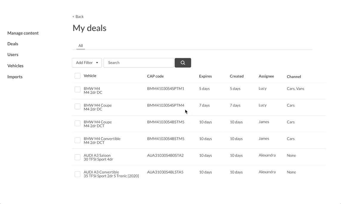
You have to scroll through every deal to find the deal you want to edit
💡 How might we create enough flexibility to find any deal with any criteria?
Workshopping is one thing, but having learned what we had it was imperative for us to change the perspective and observe how what was shared played out in their natural habitat – at their screens, going about their daily business. One critical assumption we had made was that this system was the sole system these users use to do their job. We were so wrong!
This system was just one part of their workflow, using other websites to validate their own work and gather relevant information and data to update their deals.
These findings with the procurement team helped us form an approach that would enable us to move at pace but perhaps more importantly, prevent any possible disruption to their existing patterns of behaviour by introducing any more change than necessary on top of the already significant changes afoot. We needed to keep as much continuity as possible.
This piece of the puzzle helped us form some important constraints for how we approached the interface design for this project in relation to the overall project.
Along with the learnings, the increasingly aggressive (and somewhat fixed) timelines, a large and moving scope, and an eye on a target budget all played a part in forming an approach that would aid us in delivering significant improvements on budget and on time.
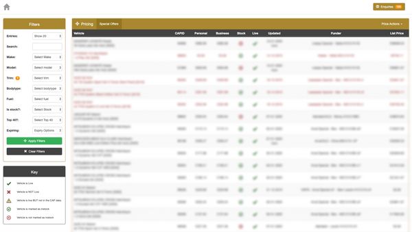
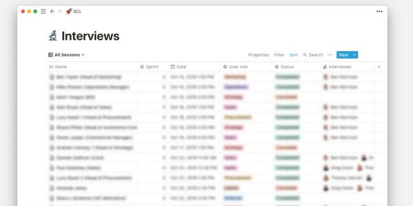
At any given time, the reason to find a specific deal could be based on any number of criteria; the vehicle, the pricing, the funder, the type of deal, the expiry date, the lead time, the internal owner of the deal, the last updated stamp, and more.
So what could we learn from other platforms and design patterns?
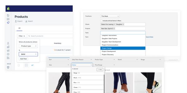
Shopify’s filtering was a great example of how a flexible search could work with the added benefit of saving specific sets of filters – a requirement that we knew would be of benefit.
We needed to sketch this flow in the context we were designing for, albeit roughly and without the amount of data we would be accommodating. Nevertheless this pattern was worth exploring.
We didn’t use this pattern in the end. Saved searches were dropped from scope and it also proved to be much slower to use than a simple set of select menus after observing the team dart around the interface quickly. The added interactions added up to be less effective and efficient.
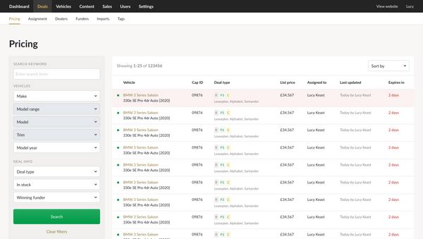
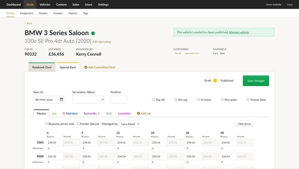
The final UI has a lot of information to convey. We really pushed the procurement team on which items of information were truly valuable at this stage of navigating deals to avoid excess and redundant clutter. The new UI incorporates: